Repository navigation
Color on each branch of rootlocus #350
Description

When using the rootlocus function the plot containing all the branches does not differentiate between branches. All of them are colored with the same blue.
I found a walkthrough for this, but you need to know well the transfer function you want to plot, like:
system=control.tf([1],np.convolve(np.polyadd(np.convolve([1,1],[1,1]),4),np.polyadd(np.convolve([1,3],[1,3]),4))) control.root_locus(system) plt.gca().get_lines()[1].set_color('b') plt.gca().get_lines()[2].set_color('r') plt.gca().get_lines()[3].set_color('g') plt.gca().get_lines()[4].set_color('m')
Where poles are the line [0], and the rest are the different branches. If you have zeros, then they are located in line[1], and the branches in [2],...
Is there any possibilty of colouring the different branches as MATLAB does?
Thank you for this module, I found it very useful!
Activity
moorepants commentedon Dec 5, 2019
I think you'd have to write a sorting routine for the computed eigenvalues because for each gain they may not be in the same order as the previous gain. For large steps between gains, I'm not sure if you can sort them, but for small gain steps you can for most cases. It isn't trivial for all bifurcation points though.
agustinvo commentedon Dec 5, 2019
I think this issue is related with this line:
where col seems to be each branch. Indeed, if
plotstrinput is modified when running the command, all the branches are plotted similarly. Its default behaviour introduces:I think setting that parameter free would color each branch separatelly. I will check later on.
billtubbs commentedon Aug 7, 2021
I just tried this and it seems to work.
Replaced:
with:
Test script:
Result before:
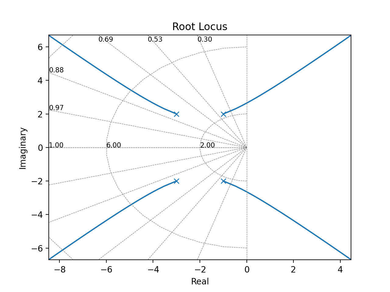
Result after:
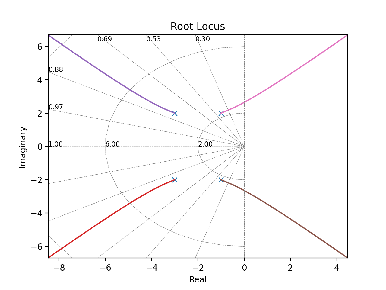
Would be nice to change the colour of the crosses too.
billtubbs commentedon Aug 7, 2021
I'm not sure what the benefit of the different colours is though. Without a legend or other way of knowing what each line is, what is the benefit?
sawyerbfuller commentedon Aug 7, 2021
billtubbs commentedon Aug 8, 2021
Here's a better example which illustrates the benefit of the coloured lines.
billtubbs commentedon Aug 15, 2021
One time when different colours per locus might be a bad idea, is when plotting the root loci of more than one system on the same plot. Is this actually useful or something that we want to support? If so, we could offer both options.
sawyerbfuller commentedon Aug 15, 2021