Repository navigation
Discontinuous Nyquist Plot #691
Description
Activity
Hi @JayEy, thanks for flagging this.
You can work around the ugly resolution of the nyquist contour by decreasing the value for the indent_radius parameter:
control.nyquist_plot(Gw, indent_radius=1e-2)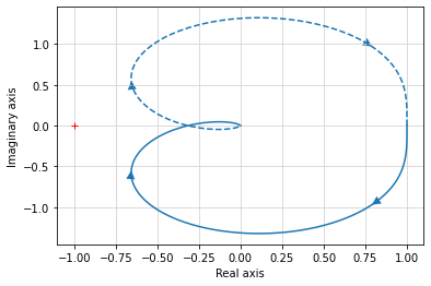
Or you set
indent_directionto'none'.Hi @bnavigator , thanks! Looks just fine with the reduced indent radius.
It would be good to think through the algorithm we are using for the indent radius (currently just setting it to a fixed value) to see if we can avoid situations like this. I'm flagging this issue as an enhancement in case someone has time to take a look at this.
We might also look at this example as part of the discussion in #671.
@JayEy maybe one issue is that you are passing the closed-loop system to the nyquist plot, but its use is to assess stability given only the open-loop system. The open-loop plot
nyquist(G0)appears to give a more reasonable plot (see below).@murrayrm One idea would be to calculate the indent radius on a per-pole basis. By partial fraction expansion, the transfer function can be approximated near a pole p by G(s) = A/(s-p)**k + B, where k is the order of the pole. One could evaluate the transfer function at two nearby points to estimate A and B. Then, to have the contour evaluate to a radius of approximately R, then the indent radius r should satisfy A/(r-p)^k + B = R, or r = p + (A/(R-B))^-k.
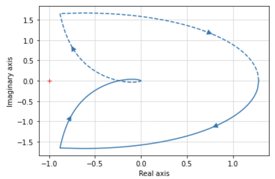
@sawyerbfuller you are right this would be the more reasonable thing to do. I just grabbed this system from an example in a book.
For my understanding you can not tell from the outside if a system is internally a closed or open loop system. G0 could already be the transfer function of a closed-loop system.
The bode plot for G0bode(G0)gives correct results. The nyquist plotnyquist(G0)as shown by you looks still strange. There is obviously a discontinouation in the left corners. You should be able to take the magnitude and phase of the bode plot and the corresponding vectors should point along the complex frequency response. Note that the nyquist plot is generally a shifted complex frequency response plot (for my understanding).
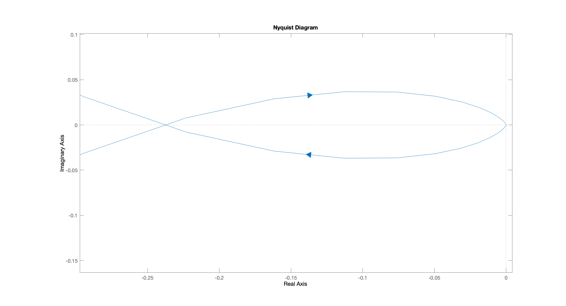
What I would expect here looks like this nyquist plot obtained by Matlab: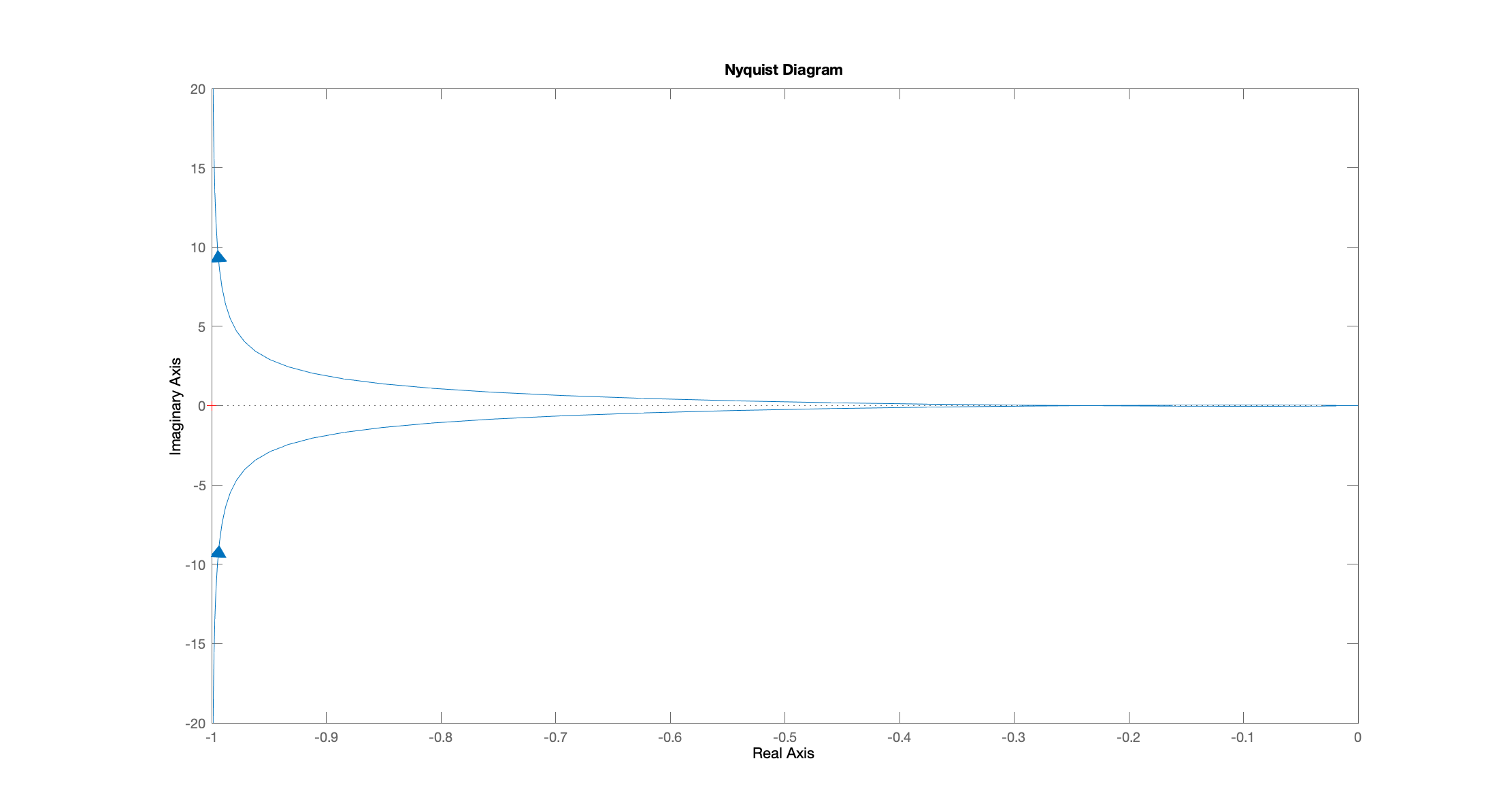
It is hard to see but the plot starts at negativ infinity with -90° phase angle, crosses the real axis at -180° and comes back in to the real axis from a right angle at -270° as you can follow along in the bode plot. Here is a close up of the right part of the nyquist plot.
I can't tell why you go into the trouble to circumvent the poles and zeros. Maybe it's easier to use the stable and correct bode plot results, use magnitude and phase to plot them together in the complex plane, shift every thing by 1 for stability analysis and mirror everything along the real axis.
Please correct me if I'm wrong and tell me what you think.
Hi @JayEy these look the basically the same to me. Indeed one way to think abotu the nyquist plot is as the path of the complex frequency response (i.e. the bode plot), but with mag and phase plotted against each other, instead of against the frequency.
Unlike Matlab, python-control takes the additional step of depicting the path of the nyquist contour as the frequency response passes near poles that are near the imaginary axis, which we think helps in understanding the path of the complete contour. Those corners are the result of that. really what is happening is that the contour extends off to infinity, and that large, backwards "C" shape is intended to represent that.
Hi there,
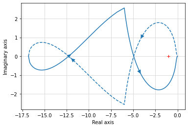
I ran into the same "problem" today, thanks for the clarification @sawyerbfuller. I think the contour that is intended to show what is happening as the frequency passes near the poles should be depicted otherwise. I'd suggest decreasing the line width, color to gray and maybe line-style to dotted.I was heavily confused by the following plot (it circles twice):
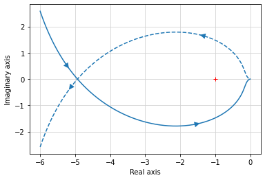
This is the nyquist plot without the frequency response near poles:
Regards


Today I used the following code to produce the nyquist plot of an arbitrary transfer function:
and I got this strange discontinuous Nyquist plot:
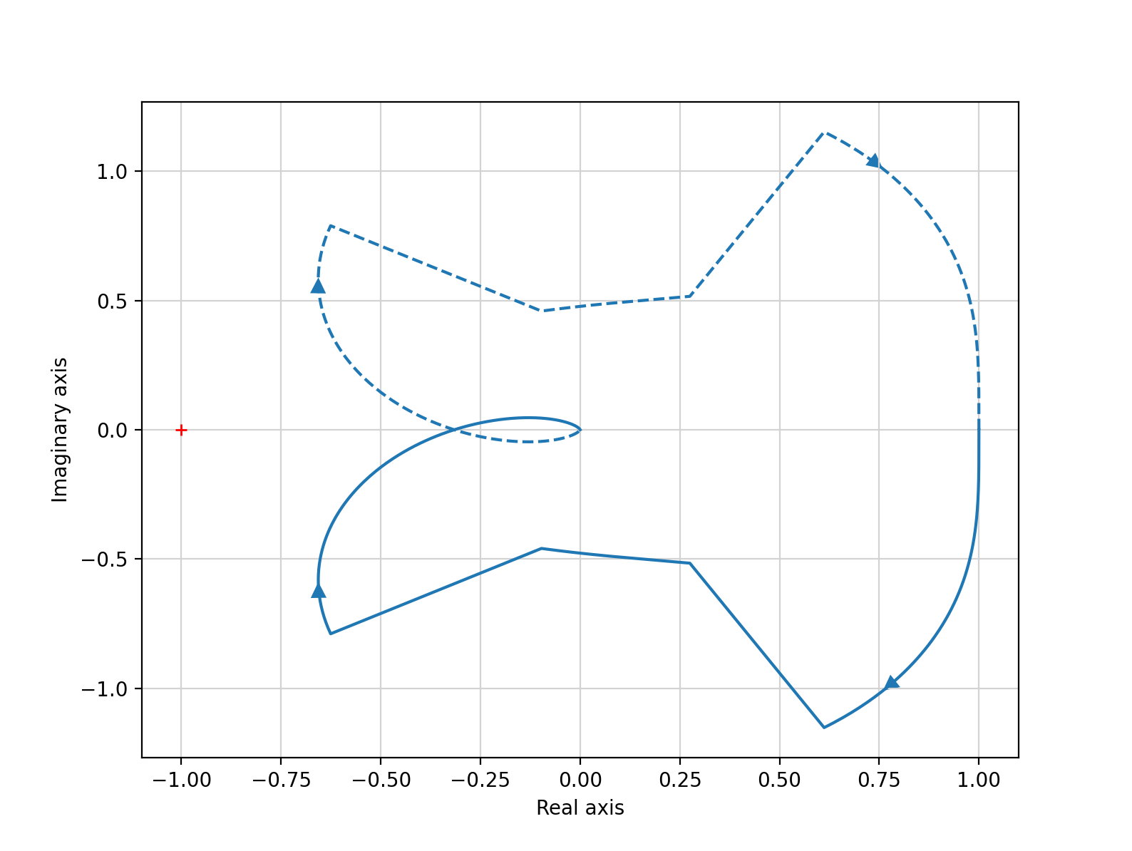
the bode plot looks correct and I found that both plots use different functions to evaluate the frequency response. So I think there might be a bug in the implementation of the nyquist plot.
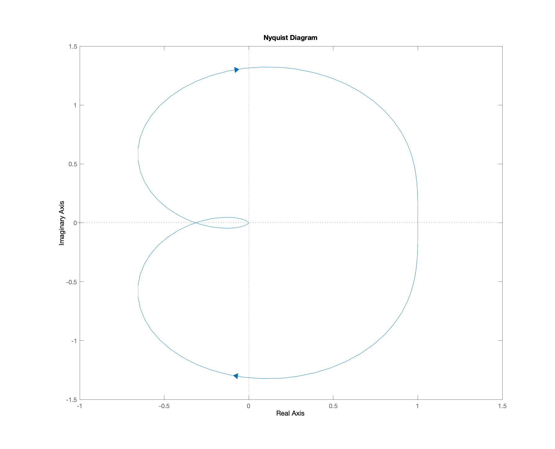
Here is the expected Nyquist plot that I could obtain from Matlab.