Skip to content

arrows in nyquist plot  #303

Description

@josujugo

Recently, the Nyquist plot adds arrows to show the directions in the diagram. However, those arrows have always the same size and the same position. Working with my students, sometimes the arrows make difficult the correct interpretation of the Nyquist plots.

New options for the arrow size and position (not always the first and the last frequencies) could help to solve the issue .

Activity

  1. geekonloose commented on Mar 3, 2020

    @geekonloose
    Contributor

    Yes, I am also experiencing this problem. Is there any hack to reduce the size of arrows?
    For example figure below,
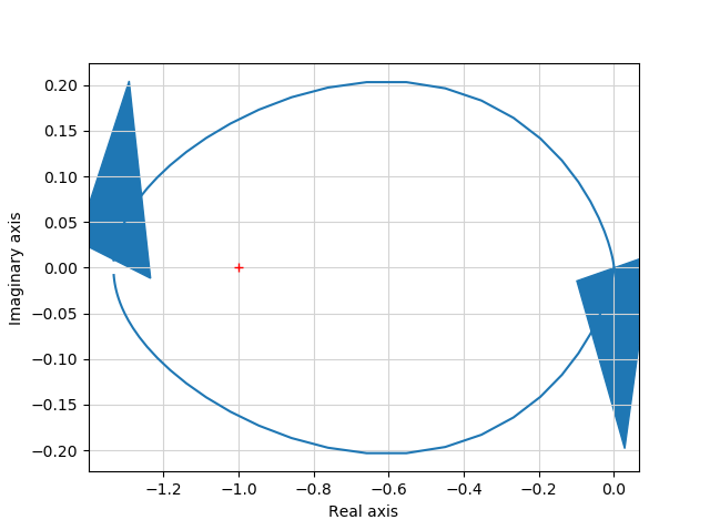
    Figure_1

  2. murrayrm commented on Mar 3, 2020

    @murrayrm
    Member

    The problem seems to be that the arrow dimensions are based on the axis units rather than an "absolute" size (e.g., pixels). It should be relatively easy to add an option to nyquist_plot to set the arrow size. Better would be to set the arrrow size so that it isn't in axis units.

    If someone wants to generate a PR for that, it would be useful. I won't have time to get to it for a while.

    Quick hack: you might be able to get the arrow object with matplotlib and reset its size.

  3. murrayrm commented on Mar 18, 2020

    @murrayrm
    Member

    PR #379 provides a quick fix that allows the arrowhead size to be set manually.

    A better algorithm that computes arrow head size automatically is still needed at some point. Arrow position is also not yet done in a good way.

  4. kobemertens commented on Aug 19, 2020

    @kobemertens

    I'm not too familiar with the issue but the matplotlib documentation suggests using an annotation with an empty string as text like this:

    >>> ax.annotate("", xy=(0.5, 0.5), xytext=(0, 0),
    ...             arrowprops=dict(arrowstyle="->"))

    Maybe this is worth looking into?

  5. bnavigator commented on Aug 19, 2020

    @bnavigator
    Contributor

    Hi @SchrodingersCat00, that sounds like a good solution, especially since the current code also just adds a dummy straight line for the arrow from the edges of the actual curve.

    # Compute the primary curve
    x = np.multiply(mag, np.cos(phase))
    y = np.multiply(mag, np.sin(phase))
    if plot:
    # Plot the primary curve and mirror image
    p = plt.plot(x, y, '-', color=color, *args, **kwargs)
    c = p[0].get_color()
    ax = plt.gca()
    # Plot arrow to indicate Nyquist encirclement orientation
    ax.arrow(x[0], y[0], (x[1]-x[0])/2, (y[1]-y[0])/2, fc=c, ec=c,
    head_width=arrowhead_width,
    head_length=arrowhead_length)
    plt.plot(x, -y, '-', color=c, *args, **kwargs)
    ax.arrow(
    x[-1], -y[-1], (x[-1]-x[-2])/2, (y[-1]-y[-2])/2,
    fc=c, ec=c, head_width=arrowhead_width,
    head_length=arrowhead_length)
    # Mark the -1 point
    plt.plot([-1], [0], 'r+')

    Do you want to submit a PR for that?

  6. murrayrm commented on Feb 11, 2021

    @murrayrm
    Member

    PR #534 fixes this issue.

  7. linked a pull request that will close this issueNyquist plot improvements #534on Feb 11, 2021
Sign up for free to join this conversation on GitHub. Already have an account? Sign in to comment

Metadata

Metadata

Assignees

No one assigned

    Type

    No type

    Projects

    No projects

      Milestone

      No milestone

      Relationships

      None yet

      Development

      No branches or pull requests

      Issue actions