Skip to content
Tech

Android Wear software review: Smartwatch software that doesn’t suck

It still requires a phone, but there’s no better way to deal with notifications.

Ron Amadeo – | 97
Story text

Google wearables: take two.

Believe it or not, Google has been a leader in the wearables space for some time with Google Glass. Glass gives users fast access to information and an easy way to see and deal with (certain) incoming notifications, but the form factor is physically and socially awkward. Wear seems like an evolution of the quick information access that Glass pioneered, all in a more comfortable, less invasive device.

I’ve used quite a few gadgets in my time, and I’ve never seen anything become as instantly useful as Android Wear has. It’s not just me, either. At Google I/O, every attendee got an Android Wear watch, and after a single day, it seemed like everyone’s behavior had changed. A notification sound would go off, which would normally send everyone within earshot rummaging through bags and pockets, but by the second day of I/O, we all just learned to check our watches. Strapping on a Wear watch for a few days changes your mobile workflow. It’s an extremely useful device that I plan on wearing from now on for the simple reason that it makes me more productive.

Just like Android, Android Wear is an OS that will end up on many different devices. The way the software looks and works is what’s most important, so just like in our KitKat review, this article will be focusing on the software only. We’re taking a look at the first hardware, the LG G Watch and Samsung Gear Live, in a separate article.

Wear feels like it is currently in a soft-launch beta state. The best-looking hardware that everyone wants—the Moto360—isn’t out yet, and Google is still in the process of rolling out enhanced Wear support to its suite of apps. Each day I’ve had the device, there has been some new update that makes something work a little better with Wear. The ecosystem hasn’t really booted up yet, either—the link to browse apps on the Play Store says “Coming Soon 7/7.” So while this is a consumer release and we’ll treat it appropriately, the real party doesn’t start until the launch of the Moto360 some time this summer. That will also be a great time to revisit the software since Google will have had several weeks of updates under its belt by then.

Before we dive in, a word about screen shapes. Wear supports both square and round displays. The OS can communicate the screen shape to the app, which can responsively rearrange things, or the developer can manually tweak the app layout. The point is, you can’t expect the round interface to look like the square one with the corners cut off—things will be shifted around a bit. For this first look at Android Wear, we’re using an LG G Watch (which is square), but round watches will also eventually be an option.

The Companion app

The Wear app’s initial setup.
The Wear app’s initial setup. Credit: Ron Amadeo

Like nearly all smartwatches, Wear devices rely on a Bluetooth-tethered phone, which needs to be running Android 4.3 and up. Running iOS or Windows Phone? You’re out of luck: no Wear for you. Smartwatches seem to be the ultimate ecosystem lock-in device. Samsung’s requires a Samsung phone, Google’s requires an Android phone, and we’re sure Apple’s will require iOS. There is so much cross-communication that needs to happen between a watch and phone that supporting multiple OSes becomes really hard. Would you switch platforms for a good smartwatch?

Would you switch platforms for a good smartwatch?

Just as with Google Glass, Wear requires its own companion app to work (several of them, actually). Setup currently involves signing up for a developer beta test group, signing up for five beta apps, and installing all of them. For consumers, things should be a bit easier.

Without a tethered smartphone, Wear is nearly useless. It can’t access the Internet or use voice commands, leaving you with only a handful of basic chronographic functions like starting a timer or stopwatch. Your first step after installing the Wear app is therefore to turn on Bluetooth, pair the watch with your phone, and give it access to the notification API. Once all the beta stuff is of the way, setup looks like it will be pretty easy for normal people. The watch actually downloads and builds an app loadout from your device. It scans your phone, downloads the Wear component for any apps that include one, and then syncs it to your watch.

Third parties can only install apps to Wear through standard phone and tablet apps, and sideloaded apps don’t work as they did on the Galaxy Gear. Right now, Google Keep is the only phone app that installs a mini-app to Wear watches, but the number of apps will grow as more developers get on board. OEMs can add their own built-in watch apps to Wear without bundling them with a regular phone app (LG’s watch includes a “World Clock” app, for example, while Samsung’s has a “Stopwatch” app), but it doesn’t appear to be possible for anyone else.

You really can’t switch between Android devices and keep your watch data. If you want to change phones, you have to wipe the watch and have it scan and re-download data. This takes a few minutes, and you’ll lose all your pedometer step-count data and settings.

The main app, picking a voice action, the unlaunched app store, and the permanent notification.
The main app, picking a voice action, the unlaunched app store, and the permanent notification. Credit: Ron Amadeo

Once you get the app up and running, it will let you tweak a small handful of settings, connect and disconnect from the watch, and pick default apps for each voice action. At the bottom of the app list is a blue “Browse compatible apps” button. Right now it opens a section of the Play Store that lists the Wear app and doesn’t say anything other than “Coming Soon 7/7,” so we’ll have to address that at a later date. Like Glass, Wear will spawn a permanent notification that will always let you know you’re connected to Wear. These things are really annoying, and we wish Android had a way to indicate that it’s connected to something without clogging up the notification panel.

Home screen

The home screen and items of interest.
The home screen and items of interest. Credit: Ron Amadeo

Android Wear is a completely new OS, so it’s worth going over what it does and how you use it. Wear is primarily driven by voice, touch, and notifications. There’s no icon grid and no keyboard, so if you want something, you usually have to speak up. The standard Android Wear home screen shows the time in the top-left, an icon in the top-right, and part of a card on the bottom of the screen.

The icon in the top-right is used for status. When disconnected from the phone, it shows a cloud with a line through it, when charging, there is a battery indicator. When you’re all set up and connected, the icon disappears for a cleaner look. Just like early versions of Android, the only way to take a screenshot is with the SDK, so you’ll see a normally absent battery icon in our home screen screenshots (alternatively, you can connect over bluetooth if your computer has the radio for it). The developer preview and a lot of Google promotional material show a “g” icon in this spot, but that was removed in the release version.

The time doubles as a tappable launcher for commands (which is what pressing the “g” button used to do in the developer preview), and long-pressing on the time will allow you to change watch faces, similarly to how long-pressing on the Google Now Launcher background will bring up the settings for the home screen.

The bottom of the screen shows a preview of the latest card from the “Context Stream.” We’ll go into this in more depth later, but for now, just think of it as “notifications.” The home screen doesn’t display the full card, just a “peek,” which gives a hint about what the first item is. Tapping this small card will sometimes perform an action, like play/pause for music.

Some watch faces, including the default one, don’t have a user-settable wallpaper the way a smartphone does. The background is a shape shifter that takes on a form related to the current notification. It uses album art for music, and it displays a contact picture for e-mails, text, or IMs. For weather, it uses an appropriate cartoon background. This is a beautiful design that keeps the wallpaper fresh while providing a clue about the current notification.

The Context Stream and navigation

The main sections of Android Wear.
The main sections of Android Wear. Credit: Ron Amadeo

White cards pile up in a vertically paginated list below the home screen, known as the “Context Stream.” It’s easy to interpret these as just “notifications,” but the Context Stream is a little more than that. If you’ve ever used Google Glass, it’s a lot like the Glass timeline. If you’re more used to Android, imagine a chronological mix of items from the notification panel, Google Now, and ongoing native apps, like a timer.

The main section of Wear is laid out like a grid. Swiping vertically will cycle through notifications, and swiping horizontally will bring up actions for that notification. Swiping from left to right on the main page of a notification (the leftmost one) will dismiss it, just like dismissing a notification on an Android phone. Tapping on the screen will activate the displayed action. It’s a pretty common sense layout.

A top-to-bottom swipe on the home screen will show a black pull-down, just like the notification panel on Android. This panel houses the date, battery level, and, if you drag all the way down, a mute switch. Mute stops the watch from vibrating and the first card from displaying on the home screen. Another swipe down will turn it off.

Saying “OK Google” or tapping on the time will bring up the voice recognizer, which is just a white screen with a red Google “g.” Scrolling down will bring up a tappable list of voice commands, and you can also access the settings and third-party apps under the “start” menu (Hi, Microsoft!).

One change made from the developer preview to the final release is the way vertical swipes work. In the preview, users could swipe vertically to move between items at any point, even if they were on an action item. In the final release, vertical navigation only works on the main page of a notification—you can no longer move vertically from an action item. In the above example, that means that if you’re in the music notification and swipe over to “next,” you have to swipe back to the main screen before you can swipe down to weather. We much preferred being able to move vertically whenever we wanted. The new layout is probably easier for novices to grasp (In the dev preview, swiping up from an action button and then down wouldn’t take you back to the same screen!) but when you know what you’re doing, the old way is faster.

For horizontal sections, there is a tiny scroll indicator at the bottom of the screen which fades away after a second (so it isn’t in many of our screenshots, but it is always there when you swipe). There is no scroll indicator for vertical scrolling, though, which makes it hard to tell where you are in a long list of items.

One nice touch is that the touch targets of Wear are also much larger than the icon that represents them. Blue action icons will actually trigger from a touch anywhere on the screen, not just within the blue circle, and things like the time/notification card on the home screen are actually just a full screen 50/50 split. Making the touch targets deceptively large helps with quickly using the watch.

One thing that doesn’t show up in the screenshots is how beautifully animated everything is. Unlike Samsung’s past smartwatches, everything here hums along at 60fps with very little slowdown. Elements bounce, slide, and spin very smoothly, which makes a Wear device feel like the iPhone of watches, and everything else feels like Windows Mobile. A few of the animations take a little too long, though, particularly things you’ll do 100 times a day, like archiving e-mails.

Notifications and Google Now—Android Wear’s killer app

Android Wear instantly beats every other smartphone platform on the market (which admittedly isn’t saying much) because of how notifications work. Every Android app can show notifications on Wear.

Android 4.3 quietly added a notification API, which gives approved applications access to all of the data in a notification. The Android Wear helper app uses this API to grab text and images from notifications, remotely dismiss notifications, and press action buttons. With all this information and control, Wear seamlessly reconfigures standard Android notification for the watch screen—zero developer work needed. Here’s how it works:

Top: An Android notification. Bottom: The resulting Android Wear notification.
Top: An Android notification. Bottom: The resulting Android Wear notification. Credit: Ron Amadeo

Android Wear data mines your phone notification panel and then creates its own interface on the watch. The thumbnail gets used as the background, the text is reflowed for the tiny screen, the app icon is pulled from the phone app, and each of the three actions (two buttons and the notification tap) get broken out into a separate action screens. The system’s swipe-to-dismiss gesture gets ported over, too.

This is what makes Android Wear so special. Because Google laid the groundwork for Android Wear one year ago with Android 4.3, the OS has out-of-the-box compatibility with most apps. Where most smartwatches need custom-built notification compatibility, what you see above is the baseline functionality for everything in Android Wear.

There are some things developers can do to their Android apps to make Android Wear work better. With no developer work, when Wear pushes actions buttons, they work exactly the way they do on the phone. So while “Delete,” will delete the e-mail, “Reply” will open the “compose e-mail” screen on your phone. This is less than ideal, but developers can add “Reply” support for Android Wear into their Android apps. This will let users either speak a reply into the watch, which would be transcribed and sent, or choose from a list of canned responses.

The icons pulled from the action buttons also aren’t always the highest resolution, so developers can provide high-rez versions for Wear. If an app has custom icons and doesn’t specify special versions for Wear, the icons will look blurry.

Developers can also add additional horizontal screens to a notification (Google calls this “Adding pages”), which would go in between the main notification page and the action buttons. The five-day weather card in the previous section is a good example of an extra page.

Notification Stacks are also a feature developers can support, which shows multiple items (like multiple tweets or e-mails) in a more useful format than Android’s single-line-per-item notification. If a developer doesn’t do any work, multi-notification cards will look just like they do in the Android notification: one card showing many messages. However, if the developer supports stacks, a single app can spawn multiple cards.

Adding context so cards pop up automatically is also supported. For instance, an app for a smart bulb would want to pop into the Context Stream when the user arrives home.

A selection of Google Now cards.
A selection of Google Now cards. Credit: Ron Amadeo

Wear doesn’t support as many Google Now cards as a phone, but it will list quite a few, which you can see above. There are some that feel really right on a watch, like the time at home, and time or location-based reminders. Most only offer the option to “open on phone,” but the few that are location based (like hotel reservations) will offer to fire up navigation. Google Now cards are much more useful when they pop up on the home screen like this instead of being sectioned off on this little screen on the left, like they are on a phone. Wear is like the ultimate Google Now machine.

The only problem with Google Now is that there is never a way to make a card come back or make it spawn a card you want to see. If you dismiss the weather, it’s gone. Even if you ask, “what’s the weather like,” it will only temporarily show you—the card doesn’t come back. The same goes for the “steps” card. Spawning cards the user is asking for would probably be a good idea.

There’s actually a general problem in Wear of not being able to undo anything. If you accidentally swipe something away, you can’t get it back. When you’re swiping back from an action button to the main page of a notification, it’s too easy to do one swipe too many and delete a card.

Commands and the “always-on” screen

Knowledge Graph-powered answers work the same way they do everywhere else.
Knowledge Graph-powered answers work the same way they do everywhere else. Credit: Ron Amadeo

There’s more to Wear than just notification cards, though. Voice input is the primary way to get Wear to do what you want, and it’s the only way to input text other than canned responses. Saying the “OK Google” hotword or tapping the time will fire up the voice recognizer. Speaking a command here will trigger it, and waiting or scrolling down will bring up the action list.

Have you ever used a Google product with voice commands? Then you know what to expect. Google really doesn’t have different forms of voice recognition. Glass, Android, Google’s iOS app, Google.com, and now Android Auto, TV, and Wear all use the same voice recognition technology. If you’re interested in testing the accuracy, just try any other Google product—in my experience, it works pretty well.

The OS also answers all of the same questions, a feature that is powered by Google’s Knowledge Graph. Ask how tall the World Trade Center is or some other question with a direct answer, and you’ll often get something back.

When the Knowledge Graph fails, you get Google Search results.
When the Knowledge Graph fails, you get Google Search results. Credit: Ron Amadeo

When the Knowledge Graph doesn’t work, you’re presented with the top three Google Search results along with the Web snippets. Wear doesn’t have a browser, so all tapping will do is open the link on your phone. The top three results are surprisingly useful, though, as in the above example, where the third one answers our question.

Wear’s voice commands. Only Google can add to this list.
Wear’s voice commands. Only Google can add to this list. Credit: Ron Amadeo

The only commands that are different between Google platforms are the “app” commands like “e-mail Bob” or “turn on airplane mode.” Above is the list of commands for Android Wear, along with an unshown “start” command, which will bring up third-party apps. The bad news is that third-party developers cannot add to this list. Any non-system apps are buried in the “start” menu at the bottom of the voice actions list. You can say the “start” command and the name of the app, like “start Phillips Hue,” but Phillips can’t register a new, more natural, actionable voice command like “turn off the lights.” The only voice commands third-party apps can use are the existing ones, which they can take over with an intent. So while Google Keep currently uses the “take a note” command, if you install Evernote, you could switch the command to the new app.

One part of Wear that works much better than most other Google products, including the latest version of Android, is the way the hotword detection works. Android does not “buffer” your voice commands after the hotword, meaning you have to say “OK Google” and pause for a bit while the voice recognizer launches. If you don’t pause, any words spoken while the voice recognition is turning on will be missed. Wear does buffer voice input after the hotword, so you can quickly say, “OK Google, set a timer for five minutes,” and it will catch everything.

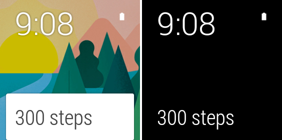
The always-on screen in “awake” (left) and “sleep” (right) modes. Credit: Ron Amadeo

The “always-on” screen of Wear devices has two states, which we’ll call “awake” and “sleep.” When the device is awake, the screen is on at full brightness and in color. After a short timeout period, it will drop to a low-power, dimmer, black-and-white mode. Users can also trigger this switch manually by placing their hand over the screen or pressing a hardware button. This also returns the device to the home screen. If you don’t want an always-on screen, you can turn it off in the settings.

While the screen is always on, the hotword detection is not—“OK Google” will only work when the screen is brightly lit up. Just like earlier smartwatches, lifting the device up to read it will wake it up, which also enables the hotword detection. When paired with Wear, the hotword detection on your phone will automatically disable itself. That way, “OK Google” doesn’t trigger both devices.

Some functions can be used without having to speak, like this timer. The Timer (and alarm) don’t integrate with the phone app. They are separate.
The stopwatch is another app that doesn’t need voice input

Watch faces

It slices and dices and runs apps, but we haven’t really talked about that most basic of watch functionality: telling time. Wear can indeed do that, with a plethora of different looks. Some are traditionally watch-like, and some are decidedly nouveau. Long-pressing on the home screen will bring up the watch face selector interface, and you can swipe through watch styles ranging from really small to really big, analog or digital, candy coated or James-Bond serious.

As of right now, it looks like watch faces can only be added by the manufacturer, and OEMs are using them in lieu of the tradition heavy skinning for differentiation—watch faces are the new TouchWiz. We aren’t sure if this is a temporary thing while Google still works on Wear or if it will always be this way.

Update: It looks like custom watch faces have been figured out! Developers can make watch faces and package them as apps in the Play Store. They’re installed as apps on your phone, (and unfortunately clog up your phone’s app drawer), and sync down to the watch.

The first watch face here is called “increment,” and it displays the number of notifications you have. These are all LG, too.
Some Samsung-exclusive watch faces.

Watch faces can change ton of little layout details on the home screen. The default one is a simple digital clock with a dynamic background, but many other watch faces have fixed backgrounds. There are two different sizes of bottom card, large and small; the watch face you have chosen will determine which one is used. The icon location is variable, too, with some having it in the top-right and others putting it in the center of the screen. A few of these (mostly the simpler ones) are on both devices.

Rough edges

Wear’s core tasks of quickly dealing with notifications and easily Googling stuff work great, and this makes up for a lot of the operating system’s rough edges. But there are certainly plenty of spots where Wear still needs work. The absence of third-party voice actions is a real bummer, and it means that apps won’t be adding anything in the way of major new voice functionality. Developers are free to petition Google to add new voice commands, but that could potentially be a slow, arduous process.

This is all Google Maps does.
This is all Google Maps does. Credit: Ron Amadeo

Google Maps is useless. It displays driving directions, but they can’t be used in a smartwatch form factor while driving. Walking directions are just a list of directions instead of a map, which is pretty lame. The most useful mapping feature would be mass transit (which Google showed working in a promo video), but there is currently no way to get mass transit directions to show up on the watch. We looked more at this downfall in our Gear Live and G Watch review.

Wear has very little in the way of app support now, particularly from Google. As a new platform, we expect a low amount of apps, but one of the best parts of Android is the Google apps, and without these, it feels like the platform still has a lot of growing to do.

There are also a ton of minor bothersome bits. Google still can’t figure out contact pictures—profile pictures are too low resolution, so they’re blurry. Some watch faces use a photo background, but none can use a photo of your choosing. The user also doesn’t have control over the cards. Say the weather card is gone and I want to see it again. How do I bring it back? I can ask to see the weather, but that still doesn’t make the card pop up. There’s also no way to “undo” a card swipe.

Notes appear on your phone in Google Keep. Alarms don’t appear in the alarm app, though, and neither does the timer or stopwatch. You can answer a phone call and there’s a special UI, but neither Wear device has a speaker, so you can’t hear anything. It will answer with the phone in your pocket. The core use cases work great, so it’s easy to overlook this stuff, but there is still a lot of room for polish.

Conclusion

When you hear a beep, you have to dig into your pocket or purse, fish out your smartphone, turn on the screen, unlock the phone, pull down the notification shade, and see what caused the beep. How you feel about Wear depends a lot on how you feel about that process of digging out your phone to check those notifications: if you do it a thousand times a day and it drives you crazy, then Wear is pretty exciting.

Wearables will never be an “essential” piece of technology, and that’s not the standard by which they should be judged—a smartwatch is a luxury item that’s tied to your smartphone and doesn’t really introduce any new functionality. What a good wearable can do, though, is let you do stuff faster and easier than you can with your smartphone, and it’s by that standard that Wear is a useful product. The days of having to find, turn on, and unlock some lost piece of plastic are over, and now addressing that ever-present beep just takes an effortless glance at your wrist.

You won’t be able to perform 100% of the normal smartphone actions from your watch. You’ll be able to see a notification, delete a boring e-mail, and send a quick text reply; and you’ll be able to verbally look up things with Google. That’s about it. I think there’s value in a device like this, and Wear will become a steady part of my personal tech loadout from now on. On the other hand, if you’re looking for a watch that will let you do away with your smartphone, that product doesn’t yet exist.

Wear blows away the smartwatch software we’ve seen from Samsung and Pebble. Google has turned the smartwatch OS from a clunky half-baked gadget to a useful tool. The core stuff works extremely well, but Google clearly has some work to do around apps, both third party and its own. That’s not unexpected of a new platform. Right now it feels like a beta release with a ton of potential, and Wear devices are already useful and are actually fun to use. We’ll check back in a few months when the Moto 360 launches.

The Good

  • Speedy, easy access to notifications and out-of-the-box functionality with all Android apps
  • Beautiful, clean design and layout that makes using Android Wear a breeze
  • Fast, accurate voice commands
  • Buttery-smooth animations (at least on our G Watch)
  • Having Google Now cards appear on the home screen makes the service much more useful
  • Everything you do on the watch instantly happens on the phone, with no clunky syncing required

The Bad

  • Apps can’t add voice commands: you won’t be able to do more with your voice than Wear does now until Google updates Wear
  • Some of the UI animations (like deleting an e-mail) take too long and you have to wait for them to finish
  • It’s easy to accidentally delete something, and there’s no way to undo a notification dismissal or bring back a Google Now card
  • Still has a lot of rough edges: Google still can’t figure out proper profile picture resolutions, and some things, like alarms, don’t sync to the phone
  • Google Maps could be awesome, but it’s currently terrible

The Ugly

  • Lack of support for anything other than Android devices—the ecosystems of smartwatches are all-or-nothing affairs
Photo of Ron Amadeo
Ron Amadeo Reviews Editor
Ron is the Reviews Editor at Ars Technica, where he specializes in Android OS and Google products. He is always on the hunt for a new gadget and loves to rip things apart to see how they work. He loves to tinker and always seems to be working on a new project.
97 Comments